Four sites. Four ways money was leaving the table.
A taxonomy of revenue defects, sorted not by industry or size, but by the shape of the leak. Each one was caught the same way: by watching real participants try to do real things on a live site, and noting where the floor gave out.

The four defect classes
All atomic checks pass. The component renders, the form submits, the auth flow returns a 200. The user, the actual person trying to do the thing, sees something nobody on the team would.
No bug, no UI failure. Each click drained a small amount of confidence to spend. There’s no error message that explains what just left.
The element renders. The participant looks straight at it. Nobody clocks it as the call to action it’s supposed to be. The conversion path stays empty, the analytics dashboard reads “low engagement,” and the team blames copy.
The site speaks one language; a sub-segment of buyers speaks another. The translation between the two is missing, and that translation is exactly what would convert them.
All four classes are the same kind of finding: a moment you wouldn’t catch from your funnel report, your error logs, or your usability lab, because none of those instruments were pointed at the moment of failure. They surfaced because someone tried, in earnest, to buy something or do something, and we wrote down what tripped them up.
01.AThe quiz that returned raw template syntax#
He hit submit on the recommendation engine. This is what came back.
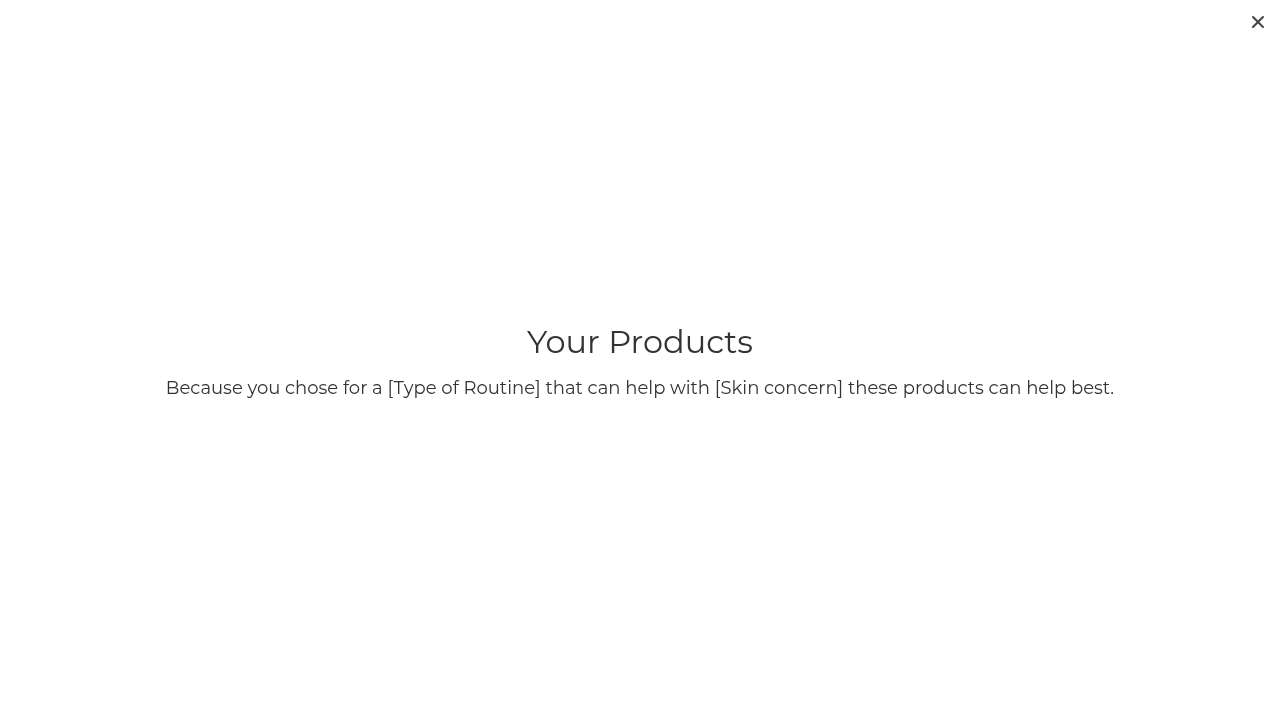
“Because you chose for a [Type of Routine] that can help with [Skin concern] these products can help best.”Read it again: because you chose for a [Type of Routine] that can help with [Skin concern] these products can help best. The interpolation never ran. The square brackets are still there. There are no products below the headline.
The page didn’t error. The user got an HTTP 200 with broken text. From the server’s point of view, this is a successful response. From every monitoring tool’s point of view, the quiz “worked.” This is the silent build bug: the kind that shows up only when an actual customer is staring at it.
“I clicked through the quiz super fast, body concerns? none, obviously, but then the results page showed broken placeholder text instead of actual skin advice. That’s a dead end.”Ryan Matsuda, 16, on what was supposed to be the moment of conversion
His sentiment dropped from +1 to -2 in a single step. The hand-holding feature that could have made the brand feel approachable to a teenager (the one demographic he represents and the one the under-18 quiz option implies they care about) is the feature that broke. He never recovered. He left the site without buying.
Full study: noemica.io/studies/stu_c2ef4f0a
01.BThe signed-in user told to sign in again#
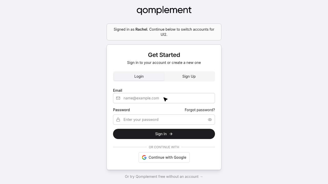
Each individual screen passed its own atomic test. The login form rendered. The verification email arrived (code 643038). The session was real. But the system, as a system, never finished authenticating her into the product she’d come to use. It kept handing her back to the same login screen, told her she was already signed in, then asked her to sign in again, this time for “UI2,” whatever that meant.
“I entered my password and it looks like I’m being taken back through authentication again, this login flow seems to keep looping me back, which is a bit frustrating when I just want to get into the tool.”Rachel Osei-Bonsu · turn 5 reflection · having just made it past signup, again
She tried it five times across eleven turns. She never sent a single message to the product. Her sentiment plot reads as an arrival, a brief moment of optimism (she was excited, the use case was a perfect fit), and then a slow grind to abandonment, all of it happening after she’d already given the company her email.
This is the same defect family as 47 Skin. No exception. No 500. Every component thinks it’s working. Only the user, the actual person trying to do the thing, sees that the joints don’t connect.
Full study: noemica.io/studies/stu_f873392e
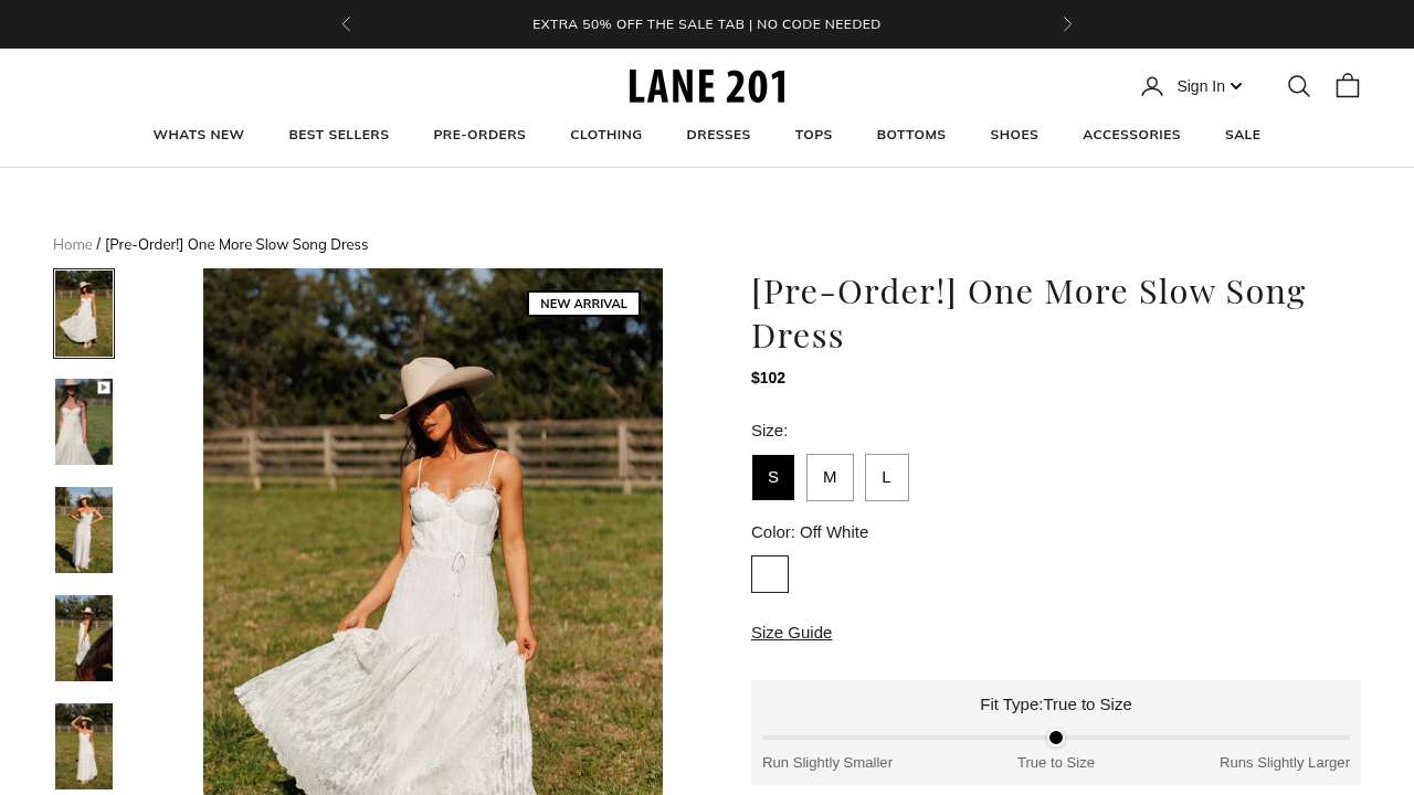
02.AThe dress with no reviews, ten days before Mother’s Day#
She found it almost immediately. The Blooming In Yellow Dress, $80, 100% cotton, “True to Size,” ruffled sleeves, the right vibe for Mother’s Day brunch. She clicked into the product page, scrolled to find the size guide, opened it, scrolled some more, found the reviews tab, clicked it.
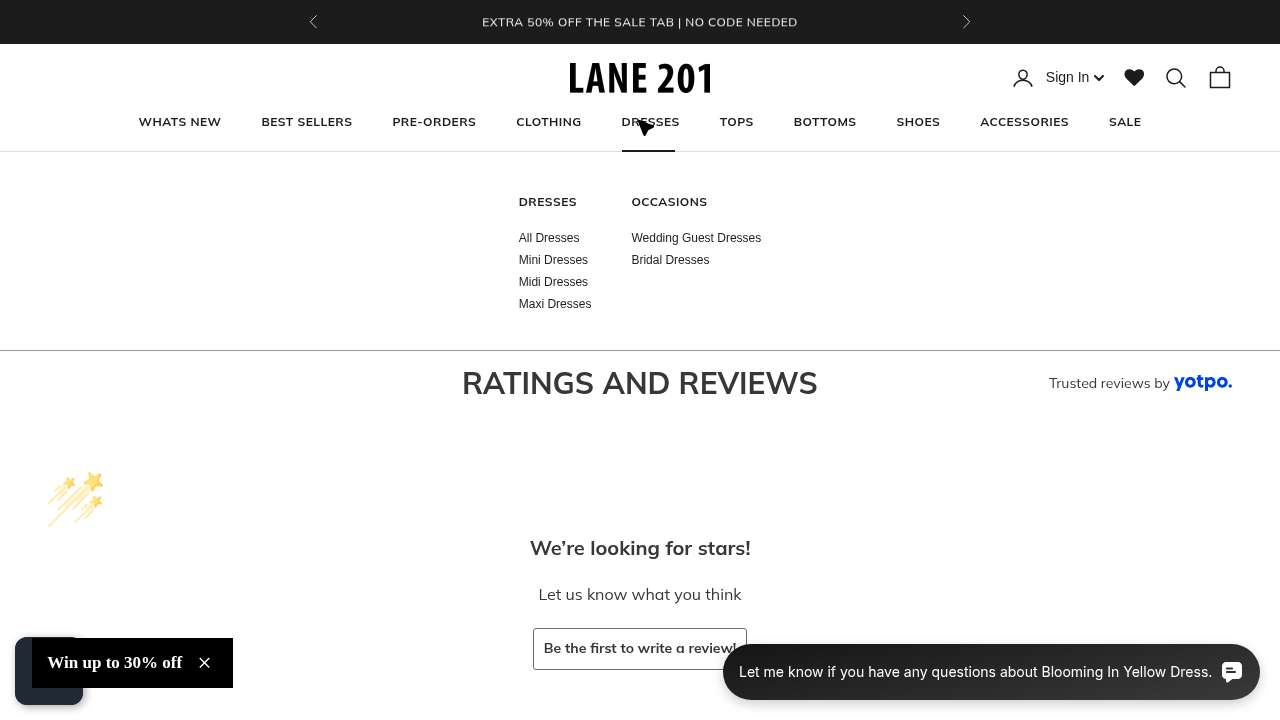
This dress was a NEW ARRIVAL. New arrivals do not have reviews. The site’s review widget does its best, with friendly micro-copy and a little shooting-star animation, but the message it delivers is unambiguous: nobody has yet bought this dress and told anyone about it.
“I checked the size guide and looked for reviews, but this dress has no reviews yet, that’s a dealbreaker for me since I really need other customers’ opinions before I commit to a size.”Participant reflection · run_4c37a3c6 · turn 2 · sentiment dropped from +2 to −1
Note what she said. Not “the price is too high” or “I don’t trust the brand.” She said: I cannot evaluate fit without other people’s opinions. The product page gave her a fit-type slider and a size guide and a 100%-cotton callout. None of that substituted for the social proof she needed to spend $80 on a gift she couldn’t return-test.
She kept browsing. She found another dress she loved (the Sweet Chapter Dress). Sold out. She found a third. 3.1 stars, mixed reviews. The session ran out before she found one that was beautiful, in stock, and reviewed. That’s not a missed conversion, that’s a person who came pre-qualified and left empty-handed.
Full study: noemica.io/studies/stu_5b32dce5
02.BTwo pre-orders in a row, both shipping after the holiday#
She filtered for dresses, picked the prettiest one in the grid, and clicked. Pre-order, ships June 9. Mother’s Day is May 10.
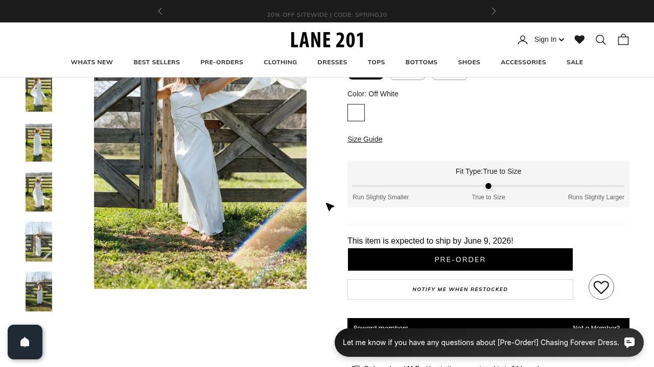
“I keep hitting pre-orders and items over budget, really frustrating when I’m trying to find something in the $60 to $80 range that’ll actually arrive in time. Hoping Best Sellers will finally surface something that fits my criteria.”Participant reflection · run_eb10a4db · turn 2 · sentiment −1
The site has the right product (she eventually found a $54 dress with priority processing and was thrilled). The site has the wrong default sort order for this season’s intent. Pre-orders are mixed in with in-stock, and there’s no “ships before Mother’s Day” filter. Two unlucky clicks in a row produced exactly the cascade described above: clicked, OOS-shaped; clicked next, OOS-shaped; momentum gone.
This is the same defect class as the no-reviews moment, just on a different axis. There, the trust gap was social. Here, it’s logistical. Either way, the customer’s confidence to spend money quietly drained one click at a time, with no error message to explain it.
Full study: noemica.io/studies/stu_5b32dce5
03The chat box at the top of the page was the product#
Look at the qomplement homepage. There’s a hero, then this:
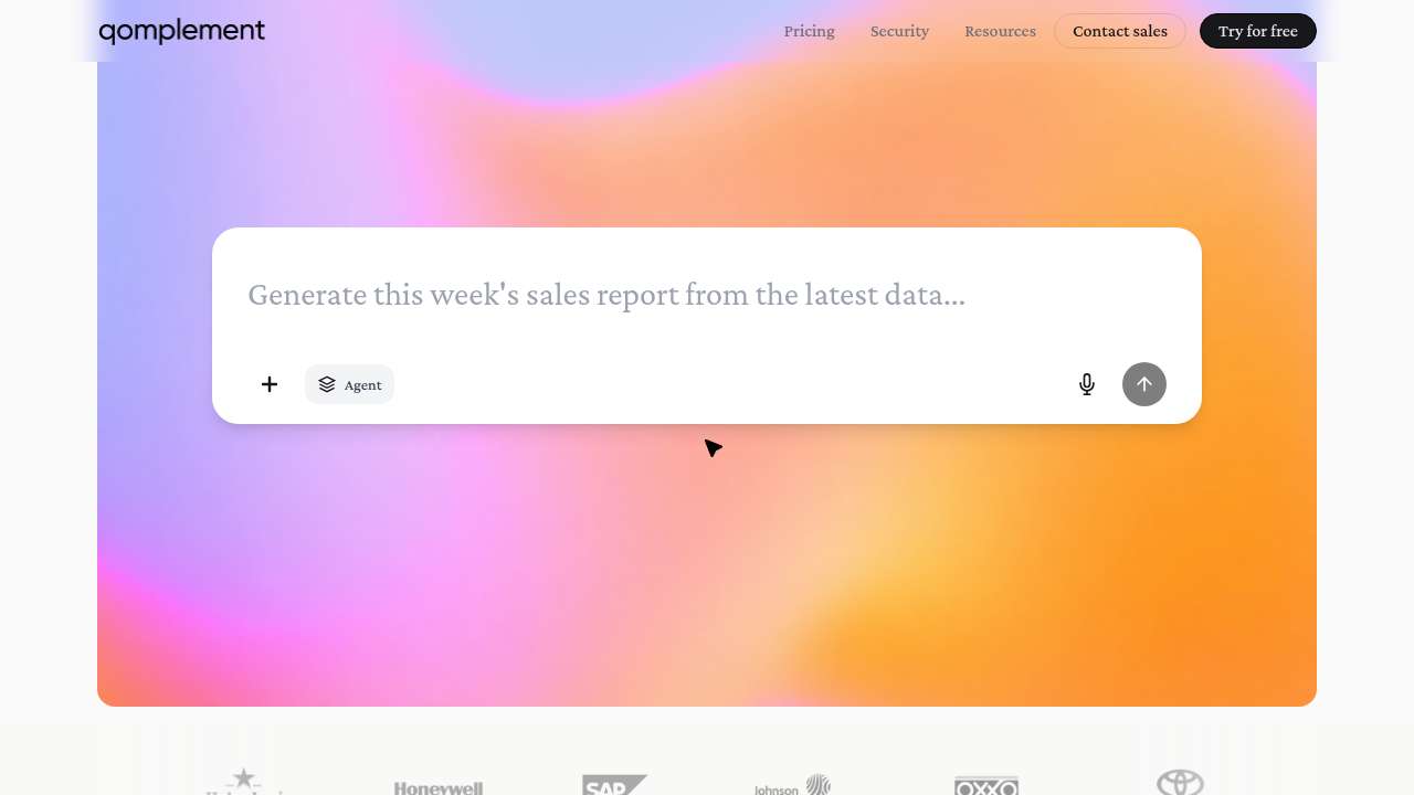
The brand’s pitch is “AI for real work in the modern office.” That box, at the top of the page, is the product. You can type into it. You can paste a real document. You can ask it to do real work, no signup, no auth, no credit card. It is the lowest-friction entry point in the entire funnel.
After ten participants moved through the site, we asked all of them four yes/no questions. Twice. The answers were identical both times.
- Did you interact with the chat box on the landing page? 10 / 10 No
- Did you know the chat box was a CTA, that you could type into it directly to try the product? 10 / 10 No
- If you had known, would you have used it? 10 / 10 Yes
This is unanimous, and it’s the rarest kind of finding: an audit on a single design decision where the participants tell you, without prompting, exactly what to do.
“Yes, absolutely. If I had realized there was a chat box I could actually type into right there on the landing page, I would have tried it immediately. That’s exactly the kind of thing I was looking for, I wanted to see how the tool handles something like a supplier quote in Chinese versus an invoice in English. A live demo right there on the page would have been the fastest way to answer my main questions. I just didn’t clock it as something interactive.”Mei-Ling Tsai · supply chain analyst · the participant who never even loaded the live product
The chat box looks like a screenshot of an interface. Clean, decorative, set inside the gradient hero. Every visual cue says “this is a marketing illustration, scroll on past.” Nothing in its styling says “click here.” The product is right there, on the homepage, doing zero conversion work, while the funnel routes everyone toward sign up, auth flows, and the broken UI2 loop documented in defect 01.B above.
Note: defect 03 and defect 01.B are about the same site. The first is “the most direct route to value is broken.” The second is “the most direct route to value is invisible.” The compounding effect is that the only people who see the product are the ones determined enough to push past two failures. Most people aren’t.
Full study: noemica.io/studies/stu_f873392e
04The site speaks product. Many buyers speak space.#
He clicked through the homepage, found Resources, found the calculator. This is what the calculator asked him for.
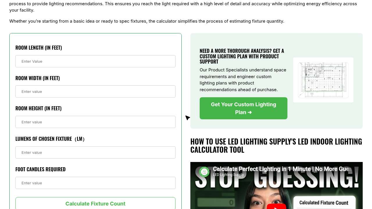
Read the bottom two fields again. Lumens of chosen fixture. He hadn’t chosen a fixture. Foot candles required. He has no idea how many foot-candles a barbershop needs because nobody outside the lighting industry has any idea how many foot-candles anything needs.
“I found the LED Indoor Lighting Calculator which seemed perfect, but now it’s asking for ‘Lumens of Chosen Fixture’ and ‘Foot Candles Required’, terms I don’t know offhand. I don’t have a fixture picked out yet and I have no idea what foot candles my barbershop needs, so I’m hitting a wall right when I thought I was making progress.”Marcus Thibodeau · barbershop owner · turn 4 reflection · sentiment dropped from +1 to −1
He dug. He found a blog post on foot-candle recommendations by application. It was alphabetical. He scrolled past airplane hangars, hotels, laundries, libraries, looking for “barbershop” or “salon” or anything close. He landed on “Retail Stores,” which covered department stores and drug stores but not personal-service spaces. The site’s knowledge base has a real, structural gap exactly where his use case lives.
He’s not stupid. The site isn’t broken. The mismatch is more subtle and more expensive: the site’s vocabulary describes the solution (lumens, fixture mounts, beam angles, IES files). His vocabulary describes the problem (“the back of my shop is too dim,” “my electric bill is killing me”). The translation between the two is missing, and that translation is exactly what would convert a Marcus into a customer.
The aggregate picture from the same study, across nine participants, made the leak measurable:
| Spec-fluent (came in with a spec sheet) | 4.0 / 5 |
| Project-clear, vocabulary-limited | 3.0 / 5 |
| Space-first, product-last (Marcus, Tom) | 2.0 / 5 |
Every row above represents a real, paying customer profile. The site is acing the top one and quietly disqualifying the other two before they can ask for a quote.
Full study: noemica.io/studies/stu_37b6ed1e
Which one is yours?#
Seven questions. Answer them honestly. Each one points to one of the four defect classes.
- In the last quarter, has anyone on your team manually completed your most important conversion flow on a real device, with a real test account, end to end?If no → check defect class 01 (silent build bug). The components pass their unit tests; the full flow may not.
- Look at the page where your customers commit money. How many recent reviews, photos, or named customer signals are visible above the fold?If “fewer than three” → check defect class 02 (trust gap). Especially acute on new SKUs and first-time buyers.
- What percentage of users who complete signup send their first message, run their first job, place their first order, take their first meaningful action?If you can’t answer → check defect class 01 (the metric exists; the dashboard probably doesn’t track it).
- On your homepage, is there a thing a visitor can do right now, no signup, that demonstrates the product? Is it visually obvious that the thing is interactive?If no, or unsure → check defect class 03 (invisible signal).
- Take three words from your homepage and three words from a typical customer support email. Compare them. Are they the same words?If your homepage uses jargon your customers don’t repeat back to you → check defect class 04 (vocabulary gate).
- Of your “out of stock” or “back in stock” or “pre-order” inventory: is any of it currently sorted alongside in-stock items in your default browse view, with no visual distinction?If yes → check defect class 02 (logistical trust gap, defect 02.B above).
- When was the last time someone not on your team sat with your site for an hour and you watched, in earnest, what they tried to do?If “more than 90 days,” or “we use Hotjar,” or “we run quarterly NPS” → check all four. Aggregates do not surface any of these defect classes. They surface only when somebody, person or participant, tries.
The four defects in this report were not found by analytics. They were found by paying attention to one person at a time, and writing down where the floor gave out. The leak you have is probably already in your funnel data, in aggregate, looking like a 3% week-over-week dip you’ve been blaming on seasonality.
noemica is built to surface any of the four defect classes above on your own site, in under thirty minutes of setup, with realistic participants walking the flows that matter. Run it once before a launch. Run it monthly as a health check. Run it the morning of a board meeting if you want to know what your funnel actually feels like.
It runs hands-off if you want the broad sweep, or you can sit in and probe deeper when something looks off, the way the chat-box discovery in defect 03 actually surfaced. The same harness works on a live site today, a static product page, a retail clone, a mobile checkout, anything you can put in front of a person.