Two bugs that compiled.
One in code, one in perception.
A YC-backed startup shipped a homepage and a flow that both pass internal QA. Ten participants put them through a noemica study. They surfaced two failures of completely different kinds. One of them you can only find by asking.
Qomplement is a YC-backed company building “AI for real work in the modern office.” That’s their tagline, and it’s a fine one. Their homepage is clean, the typography is good, the trust signals are in place. If you walked past a colleague’s monitor and saw it, you’d nod.
noemica ran ten participants through it. Finance, legal, ops, dev, supply chain. North America, Europe, Asia, Africa. Real first-time-visitor headspaces. The study asked one question: does this site convert a cold visitor into someone who takes a next step?
The answer was mostly no. The interesting part is why. The site failed in two completely different ways, and one of them was invisible until a participant was probed about it.
act iThe atomic actions all worked. The user was never authenticated.#
Rachel Osei-Bonsu, executive assistant at a London PE firm, made it further into the product than anyone else in the study. She is the most damaging signal in the dataset.
What happened
Rachel found the homepage immediately compelling. The Free tier promised three documents a day with no credit card. She signed up cleanly. The form took her email, name, and password without resistance. She landed inside the app. She saw kirbi, the chat assistant, with prompt suggestions written exactly for her job: “Help me finish my report. Update my Excel file with new data.”
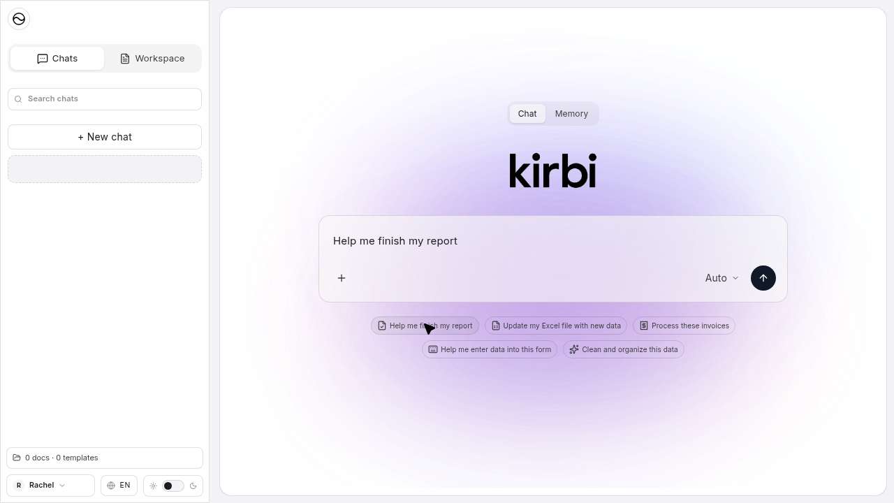
She clicked send. The app redirected her to a second login screen, labelled UI2, with a notice she will remember more than anything else on the site:
Signed in as Rachel. Continue below to switch accounts for UI2.UI2 secondary auth screen · run_71922d39 · step 35
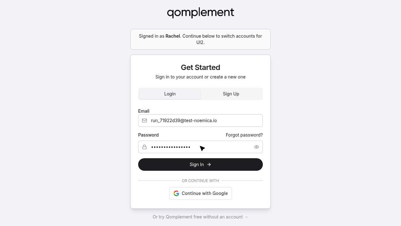
She entered the same credentials. UI2 accepted them. The app sent her back to kirbi. She clicked send. UI2 again. She did this five times. She tried the Sign Up tab on UI2 instead. She enabled a “Clouds UI (beta)” toggle in settings hoping it might fix it. She received a verification email with code 643038, and there was nowhere in the application to enter it.
The reflection that closes the loop
Every single time I tried to send a message, the app redirected me to what looked like a completely separate login page, labelled “UI2” if I’m remembering correctly. It wasn’t framed as “please verify your email first” or “please log into this connected service.” It just kicked me to a login form. No explanation.Rachel Osei-Bonsu · run_71922d39 · friction-points reflection
I got a verification email with the code 643038 pretty quickly after signing up. But there was no verification step anywhere in the onboarding flow, no “enter your code” screen, nothing in the account settings, nothing in the kirbi interface. The code arrived and I had absolutely nowhere to put it.Rachel Osei-Bonsu · run_71922d39
Why this is the dangerous kind of bug
If you write a unit test for the signup endpoint, it passes. If you write a unit test for UI2 login, it passes. If you write an e2e test that submits the form and waits for a 200 response, it passes. The system is not failing at any individual layer. It is failing at the seam between two of them, at the place where qomplement’s identity provider and kirbi’s identity provider were supposed to agree about what an authenticated user looks like, and don’t.
This is the bug that ships. It survives every reasonable QA check because every reasonable QA check operates inside one component at a time. It only surfaces when a real user, with real intent, tries to do the thing the product is built for, and a participant doing exactly that is what surfaced it here.
“I never sent a single message. I never uploaded a document. The core thing I came to test, I couldn’t test at all.”
rachel osei-bonsu · run_71922d39 · sentiment C “lukewarm” · terminal_reason: goal_reached
Goal reached, in the sense that she conclusively confirmed the auth was broken. Not in the sense that she got what she came for.
aside · the qomplement team saw this report and patched the auth flow shortly after.
act ii“What did you think the call to action was?”#
The first finding came from participants getting stuck while behaving naturally. The second came from something else entirely. After the runs were done, the study designer noticed not one of the ten participants had mentioned the chat box on the homepage. He opened the post-run designer chat and started asking.
The thing every participant saw first, and none of them named
This is what loaded for all ten of them when they hit the homepage:
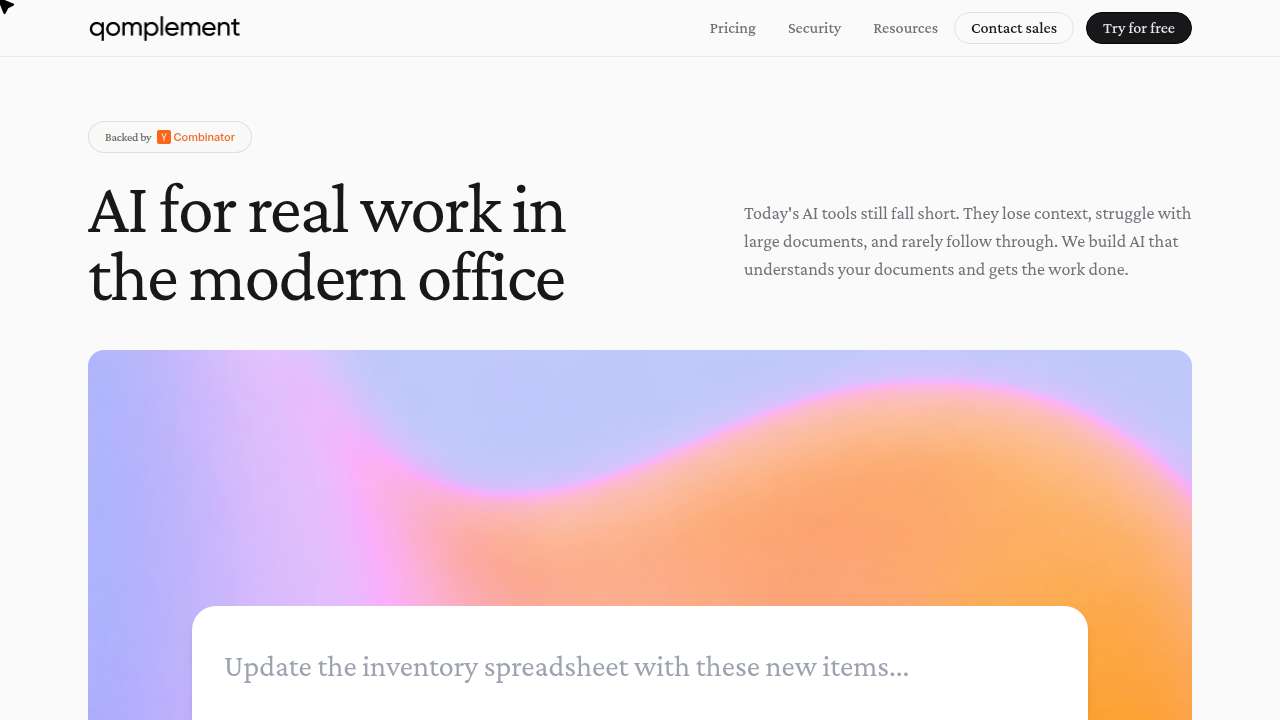
Look at the box. It is shaped like the input field of every AI tool the participants have used in the last two years. It has a placeholder that reads like a prompt. Anyone designing this interface knows what it is for. The intent is obvious from the inside.
The user running this study suspected the box might be the actual primary CTA: a try-the-product-without-signing-up moment baked into the hero. He asked all ten participants what they thought the call to action was on the landing page. Every participant listed buttons. “Try for free.” “Get started.” “Contact sales.” “Book a demo.” “Learn more.” Nine described the chat-style box as nothing at all. The tenth never reached it.
How this finding actually surfaced
None of the ten participants flagged the chat box during their runs. They navigated qomplement.com the way a cold visitor would, scrolling, clicking nav, signing up, getting stuck in the auth loop. None of them probed the page. None of them tried to interact with the chat-style box on the homepage. That silence was the signal, but the silence on its own was not the finding.
After the runs ended, the study designer reviewed the transcripts and noticed the absence. So he did what a usability researcher would do in a one-on-one debrief: he opened the post-run designer chat, where the participants are still reachable, and asked them about it directly.
The probe
From the designer chat, after every run had completed, he sent a four-question yes-or-no probe to all ten participants:
- Did you interact with any call to action on the landing page?
- Did you interact with a chat box on the landing page?
- Did you know that the chat box on the landing page was itself a call to action, i.e., that you could type into it directly to try the product?
- If you had known the chat box was an interactive call to action you could type into, would you have used it?
Here is what came back:
| participant | interacted with CTA | interacted with chat box | knew it was a CTA | would have used it |
|---|---|---|---|---|
| Sandra Okafor · legal ops | YES | NO | NO | YES |
| Rachel Osei-Bonsu · exec assistant | YES | NO | NO | YES |
| David Park · head of ops | YES | NO | NO | YES |
| Laura Méndez · finance | YES | NO | NO | YES |
| Amir Hossein Karimi · dev | NO | NO | NO | YES |
| Tom Breivik · small biz | YES | NO | NO | YES |
| Priya Nair · PM | NO | NO | NO | YES |
| Carlos Fuentes · CFO | NO | NO | NO | YES |
| James Whitfield · IT director | YES | NO | NO | YES |
| Mei-Ling Tsai · supply chain | NO | NO | NO | YES |
chat box
as a CTA
if they’d known
The user re-ran the same probe a few minutes later to check for stochastic noise. Every participant returned the identical four answers. The signal is not soft. It is not “most people miss it.” It is the entire room.
Two of them broke format
Yes, almost certainly. That’s exactly the kind of hands-on signal I was looking for. If I could have typed in a sample document or a question about data handling and seen how it actually responded, that would have told me a lot more than scrolling through a security page. I would have tried it.James Whitfield · IT director · the only enterprise evaluator above sentiment band C
Yes, absolutely. If I had realized there was a chat box I could actually type into right there on the landing page, I would have tried it immediately. That’s exactly the kind of thing I was looking for, I wanted to see how the tool handles something like a supplier quote in Chinese versus an invoice in English. A live demo right there on the page would have been the fastest way to answer my main questions. I just didn’t clock it as something interactive, which is on me, but also maybe on how it was presented.Mei-Ling Tsai · supply chain analyst
What the founders presumably believe
The chat-style box is the most prominent element on the homepage above the fold. It is centred. It uses the visual language of an AI input. The placeholder rotates through realistic prompts. Every signal a designer can send from their side of the screen says: this is the product. type here.
The founders almost certainly believe this is doing meaningful conversion work. It is the lowest-friction path into the product on the entire site. No signup, no form, no commitment. Just type and see what happens. It is, by design, the primary CTA.
It is invisible. Ten out of ten cold visitors did not perceive it as interactive. Every participant who had the bandwidth to imagine using it said they would have. That is a missed conversion path, on every visit, that the team cannot see from inside the building.
Two defect classes, one site, one study.
The auth-loop bug is the kind of defect a careful engineering team will fix in a sprint, once they see it. It is a bug. Bugs get filed and bugs get closed.
The invisible-CTA finding is harder. It is not a bug. The element is doing exactly what it was implemented to do. The defect lives in the gap between what the team intends the page to communicate and what cold visitors actually perceive. There is no log line that catches it, no test suite that flags it, no analytics dashboard that would cleanly attribute the missing conversions to not understanding the chat box was a chat box. You only find it by asking real first-time visitors what they thought the call to action was. And the painful part is, you have to ask, because nobody volunteers “I missed your primary CTA” on their own.
Both threats were already in production. One ships in code. The other ships in perception. A real team can ship both kinds without noticing either one.
If you build something cold visitors are supposed to use, the surface area where these failures live is bigger than the surface area your QA covers. That gap is what noemica was built to close.
If you have an environment, live, staging, a static product line, a kiosk clone, you’d like watched the same way, write to seb@noemica.io.